A few months ago, I reviewed AgileTask in the post AgileTask Feedback. I liked it, and my biggest piece of feedback to Rob was -
The biggest one I’ve got for you – try tweaking your Call-to-Action. “Sign Up Now – 30 Days Free”
I’m almost certain you could get a higher conversion rate. Perhaps “Take it for a spin”
Or “Get Started – be rolling with AgileTask in 7 Seconds”
If you A/B test your call to action, I reckon you’ll be able to find one that gets people to try the product at a much higher rate.
“Sign Up Now” sounds like a big commitment and “30 Days Free” makes me focus on the paying aspect, and makes me wonder if I’ll have to give a credit card to try.
So I’d recommend testing all of those elements and seeing what gets people trying it most often.
Rob just wrote to me to follow up, and it looks like things are going well -
Back in April I asked Sebastian for his thoughts on our web app, AgileTask [http://agiletask.me]. He was nice enough to provide some feedback for us, and we acted on a couple of his suggestions. Here is what we found.
Split testing was number one on the list. Specifically, we wanted to test the Sign Up button. To do this we chose a little app called Ninja Button [http://ninjabutton.com]. It has a built in button maker and was extremely simple to integrate into our app. It handles balancing the number of impressions between users and does a pretty great job of showing one user one button.
We made four buttons to begin with. We used two along the lines of Sign Up Now, and two that Sebastian had suggested, Get Started – Be rolling with AgileTask in 7 seconds and Take It For A Spin. After just two weeks it was apparent that the more traditional Sign Up buttons were lagging behind in conversions. Then after a couple months of running the tests we decided to make Take It For A Spin our official call-to-action button.
By the end of the test we found that Take It For A Spin and Get Started each had double the conversion rate of the Sign Up buttons.
Cool!
We also tried out a couple other things that have helped clean up our home page, and reduced confusion about the app. We made important stuff bigger, swapped out the Noob achievement, and added some larger screenshots. Overall, we are quite happy with the results.
Thank you Sebastian for your help.
My pleasure! Congrats all the way around.
Remember, readers - small changes can make a big difference, especially on your call to action. That's like the crux of your whole business. So - test, test, test. Make it sound friendlier, more exciting, faster, less of a commitment, and less scary.
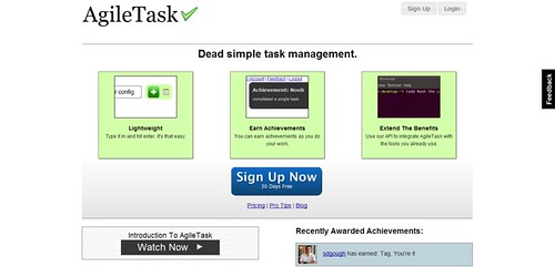
Here's the before version -
After -

You can check out Rob's app at http://agiletask.me and my original full review at http://www.sebastianmarshall.com/agiletask-feedback. And if anyone wants me to do a quick review your business or project, drop a line. Email volume is high lately, but I'll get back to you when I can. Congrats Rob and best wishes!